One Folder of Photos, Several Ways to Look

A photo set should live next to the words it supports. Folder-backed media gallery does that: put the files in a folder under the content item, write one ::gallery directive, and choose how the set should look on the page.
That is the same idea as Markdown slides: one author-owned record, more than one way to read it. Slides turns a page into a deck. Gallery turns a folder into a presentation of images.
This page is the single feature sample for the capability: browse layouts, large, stage, and story — same model, several presentations. Parameter tables and every mode’s live sample also live in the media gallery guide.
Start with the folder
Create media/ beside content.md, drop in images, and name them in the order you want them seen. Then:
::gallery{folder="media" layout="mosaic"}The runtime expands that directive into a media block. Paths stay item-local. You do not upload the set to a separate site media library just to show it in one article.
The images on this page ship in the repository under this article’s folders. They are not hotlinked. When the site builds, those files travel with the content.
Browse layouts
Small grids are for scanning. They are also where click-to-expand (lightbox) helps: open a tile, then move with the arrow keys inside that gallery only. Browse layouts turn lightbox on by default (lightbox=false turns it off).
Mosaic
One hero tile, companions around it. Incomplete last rows expand so the block stays a rectangle.
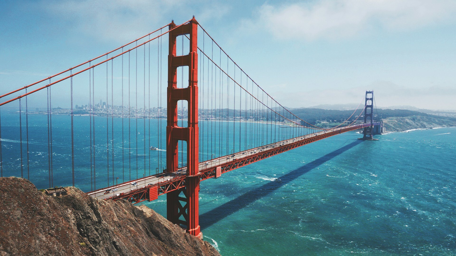
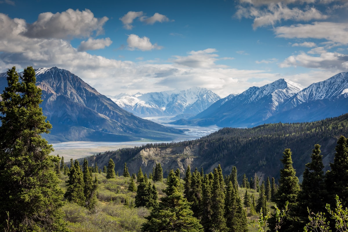

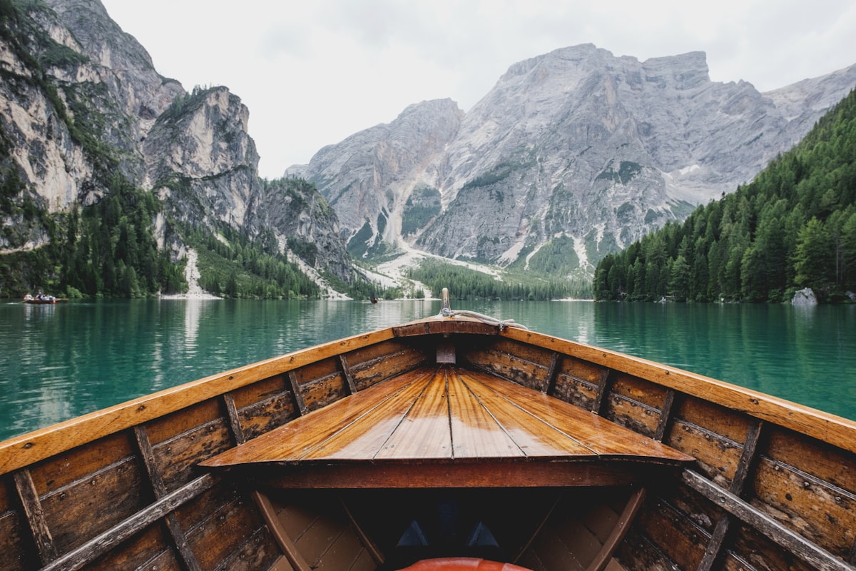
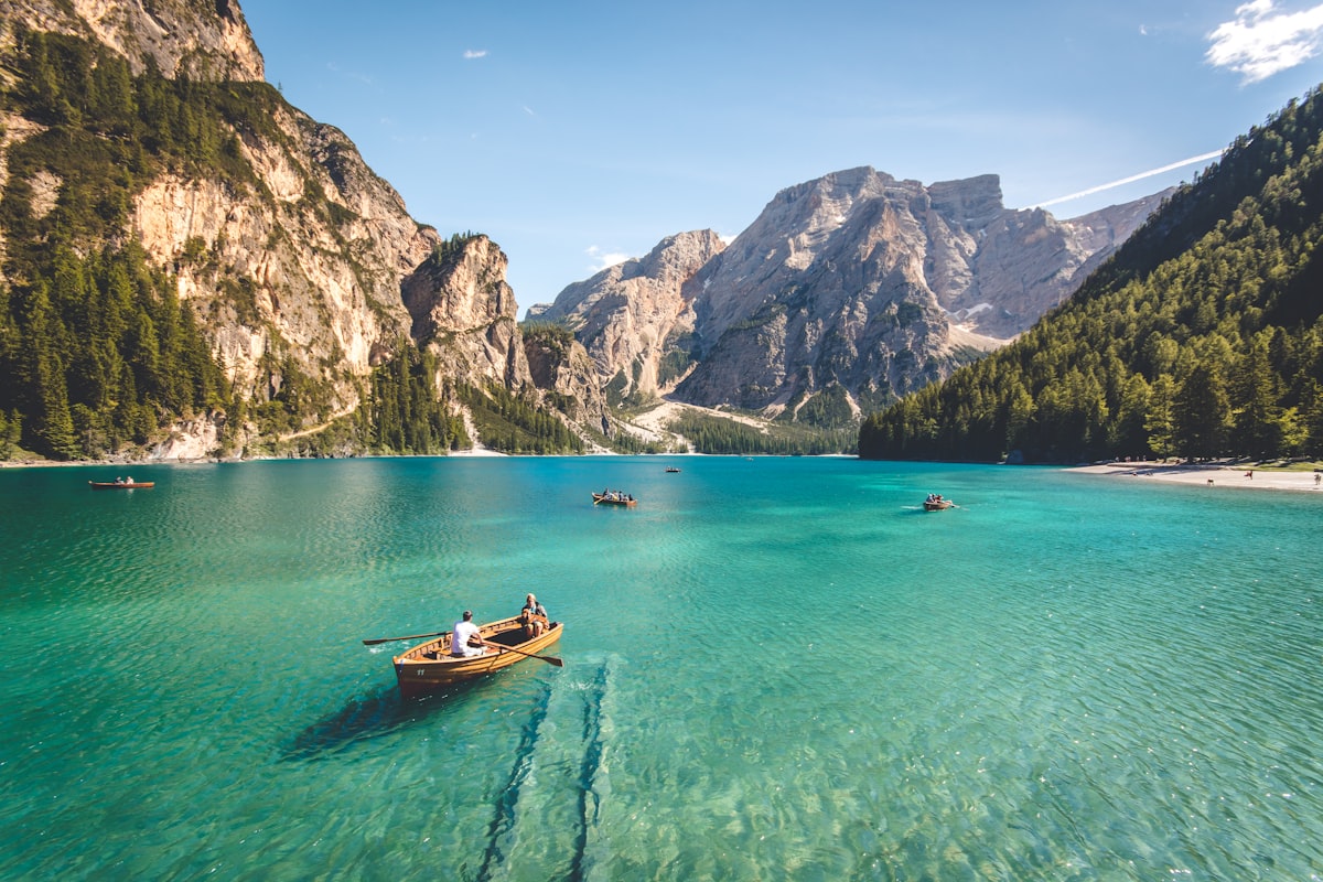

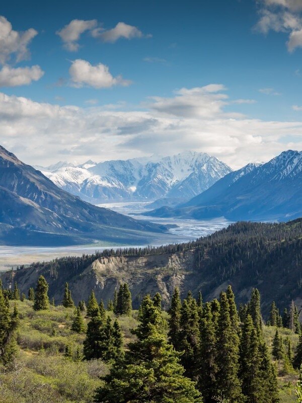

Grid
Equal squares; denser or looser with cols.
Pair
Diptych — two frames, equal weight. Before/after or call-and-response.
Masonry
Natural heights when aspect ratios disagree. Columns pack so height range stays small.
Film
Contact sheet — scan a whole set without committing to a hero.
Large
Simple full-width stack when each frame should breathe alone. Lightbox defaults off (already full-width); force with lightbox=true if needed.
Stage
One full-viewport plate at a time. Caption text sits on the image (corner or edge), driven by a per-file sidecar — not a line under the photo. Lightbox stays off by default so a click does not open a second fullscreen.
Sidecar shape:
---
title: Ridge
overlay: bottom-left
tone: dark
---

Optional longer line on the plate.
Full-viewport plates. Scroll, or leave the page as one media block.
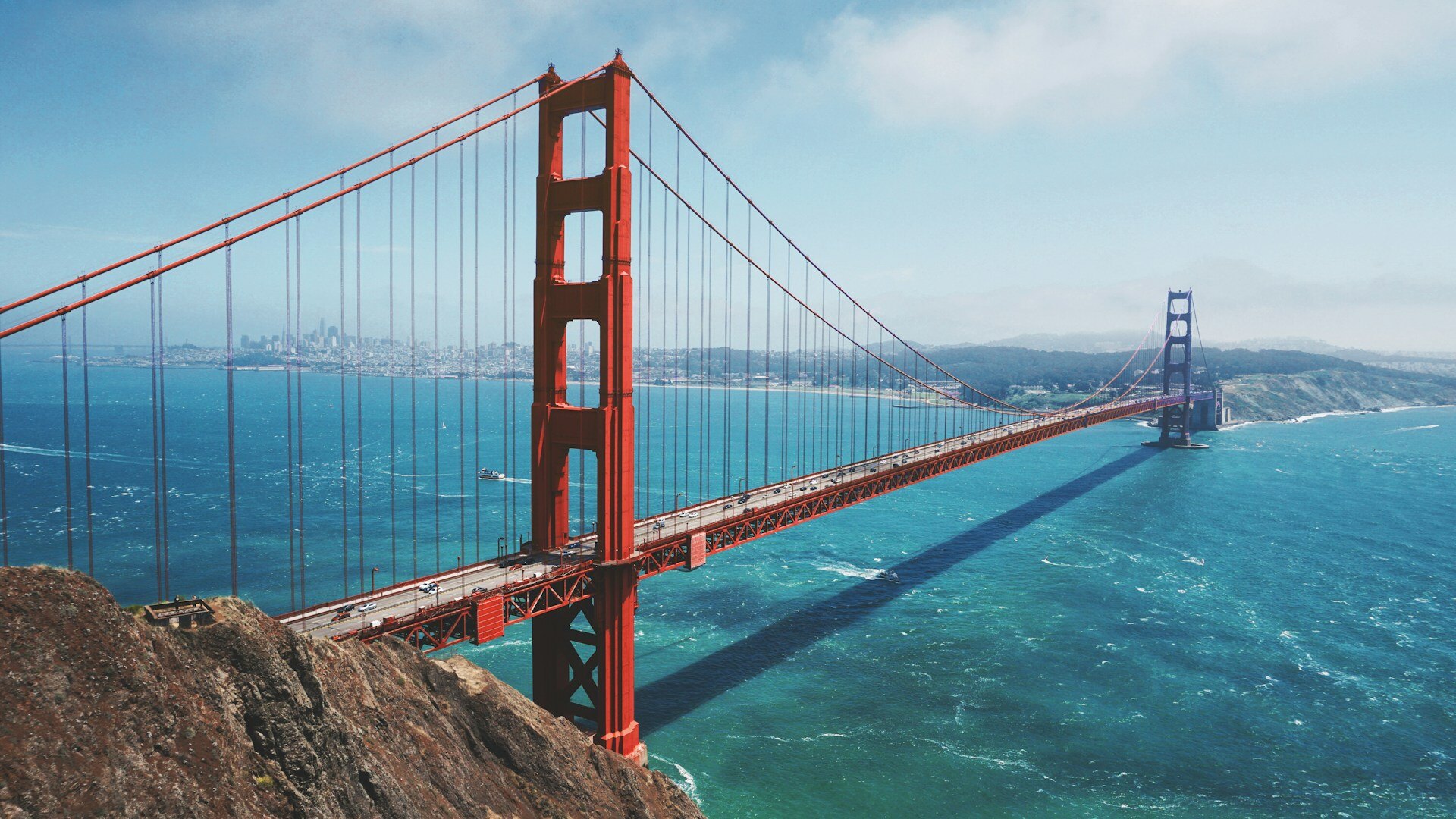
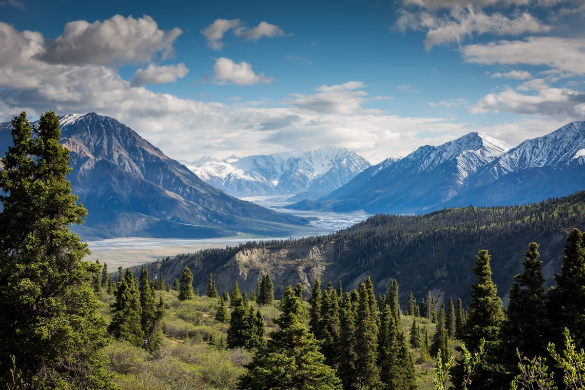

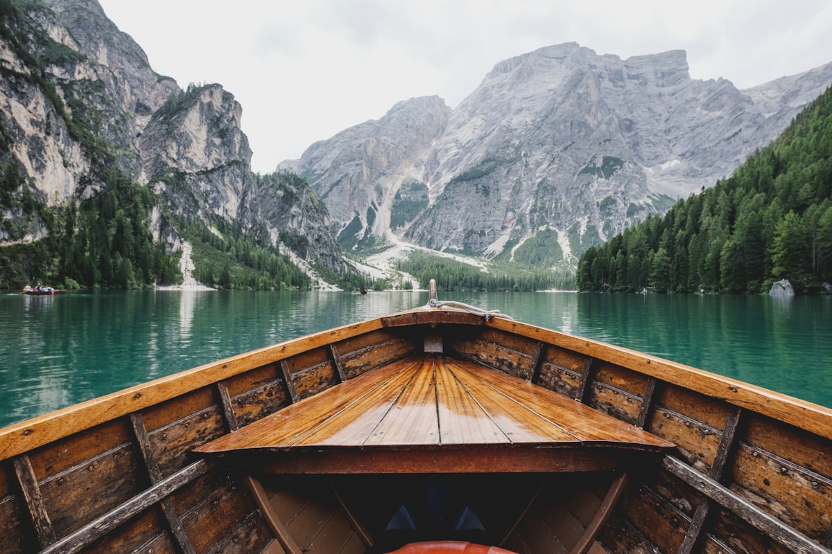
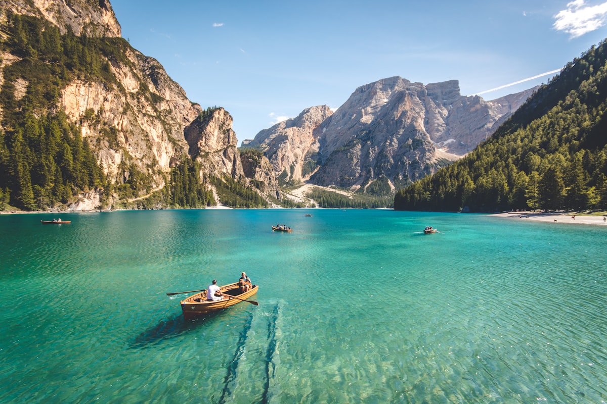

Story
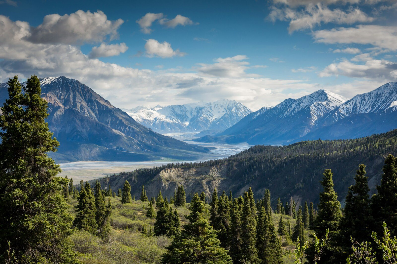
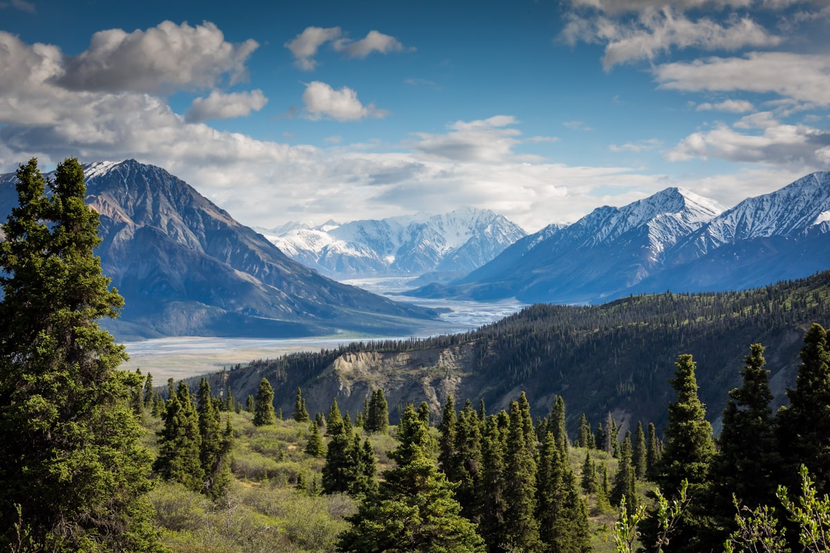
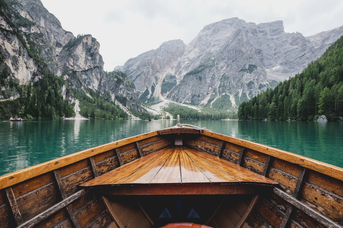
Full-bleed scroll of tall plates. Same overlay captions as stage — title and body on the image via sidecar overlay / tone. Still item-local media.
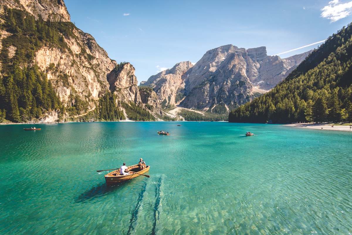
A magazine scroll of full-bleed plates. The road decided the itinerary.



What authors control
| Control | What it does |
|---|---|
folder | Item-relative media directory |
layout | mosaic · pair · grid · masonry · film · large · stage · story |
cols | Grid density (2–6) |
lightbox | Optional fullscreen; defaults on for browse, off for large/stage/story |
Folder content.md / sidecars | Lede, captions; for stage/story also title, overlay, tone |
::gallery{folder="media" layout="mosaic"}
::gallery{folder="media" layout="pair"}
::gallery{folder="media" layout="grid" cols="3"}
::gallery{folder="media" layout="masonry"}
::gallery{folder="media" layout="film"}
::gallery{folder="media" layout="large"}
::gallery{folder="stage" layout="stage"}
::gallery{folder="story" layout="story"}
When not to use it
- A single inline image with no set → use ordinary Markdown image syntax.
- A free-positioned design board or heavy motion deck → not this block.
- A site-wide media browser or DAM → gallery is per content item, not a catalog product.
- The AUP
photo-storywidget is a different layer; do not treat the two as interchangeable.
One source of truth for the set
When the photos change, update the folder. When the layout should change, change one attribute. The article and the docs sample can share the same pattern without parallel exports.
That is the capability: a folder next to the writing, and a small set of honest presentation modes—including optional lightbox—so the page can look like a magazine spread, a contact sheet, or a full-bleed story without leaving the content model.