Storytelling with Immersive Gallery

One immersive plate.
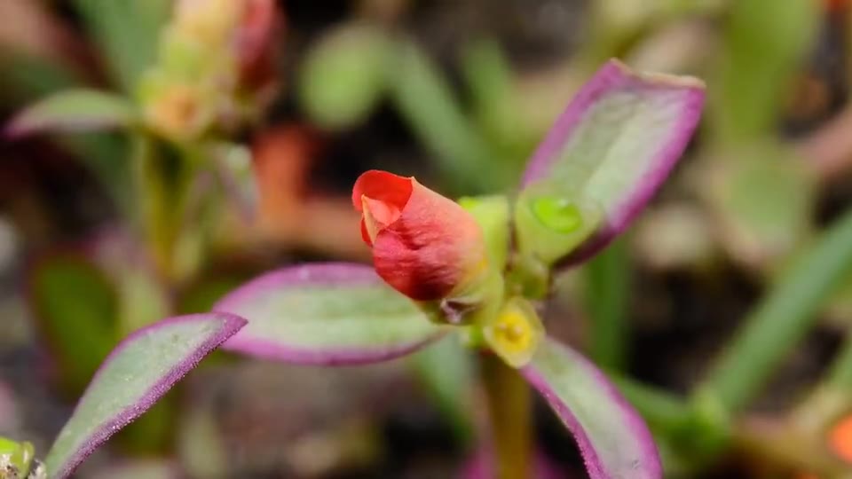
That is the product: cover first, then a muted seamless loop — here a single square plate so the motion hits without a full-viewport scroll tax. Same folder-backed ::gallery as still photo sets. No second media system, no separate “video content type.”
Web Device is picky about how words and media show up on a page. Not only what you write, but how a reader meets it. Immersive plates are one small register in that bet: the frame can move after it arrives, without turning the article into a player UI.
Why this matters for writing
Most of the web still treats media as decoration bolted under a paragraph. The photo sits in a box; the caption sits under the box; motion, if any, is a separate embed that breaks the rhythm of the text.
Web Device leans the other way. Markdown slides keep one record and offer more than one way to read it. Gallery keeps one folder next to the article and offers more than one way to look. Cover+video sits on that same line: media stays item-local, layout is honest about storytelling (stage / expose / story), and first paint does not wait for a video decode.
You get a Live Photo kind of behavior without inventing a new product noun. The plate is still a plate. The folder is still a folder.
Same folder, paired files
Put stills and short clips beside content.md. Pair them by filename stem (or declare video: / poster: in a sidecar when names cannot match):
hero/
  bloom.jpg
  bloom.mp4
  bloom.md          # optional title / overlay / tone
Then:
::gallery{folder="hero" layout="expose" ratio="1:1"}expose is an alias of stage. Caption sits on the image via sidecar.
Size the plate: ratio · width · height
Stage defaults to a full-viewport plate. For an in-article demo (or a square Live Photo feel), set any combination of:
| Prop | Aliases | Example | Role |
|---|---|---|---|
ratio | aspect, aspectRatio | 1:1 · 16/9 · square | CSS aspect-ratio |
width | w | 24rem · 100% · min(100%,36rem) | Plate width |
height | h | 50vh · 400px | Plate height |
::gallery{folder="hero" layout="expose" ratio="1:1"}
::gallery{folder="hero" layout="expose" ratio="16:9" width="100%"}
::gallery{folder="hero" layout="stage" height="50vh"}
::gallery{folder="hero" layout="stage" width="32rem" height="18rem"}
With only ratio, width defaults to min(100%, 36rem) so a square sits in the reading column. Without ratio / width / height, stage stays full-viewport.
The clips on this page ship in the repository under hero/ and plates/ (related: immersive gallery guide). License: plates/_ATTRIBUTION.md.
What you should see
| Phase | Behavior |
|---|---|
| First paint | Cover still (fast fallback) |
| When video is ready | Crossfade into a muted looping clip |
| Audio | Starts muted; Unmute only if the file has a track and the reader chooses |
| No video sibling | Plate stays a still |
Needs a Web Device runtime with cover+video immersion and sized-plate CSS. Older builds may show covers only or full-viewport stage without ratio.
More demos
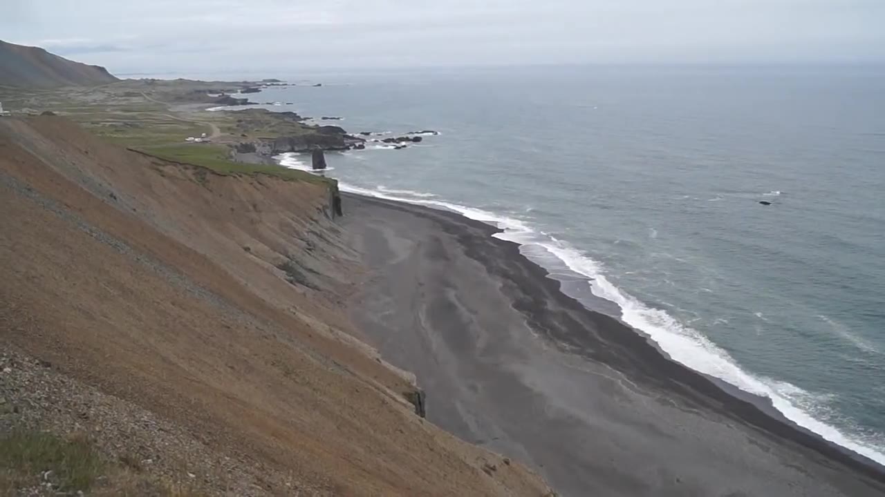
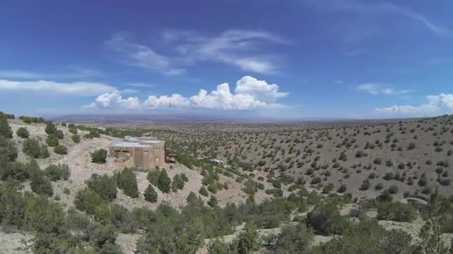
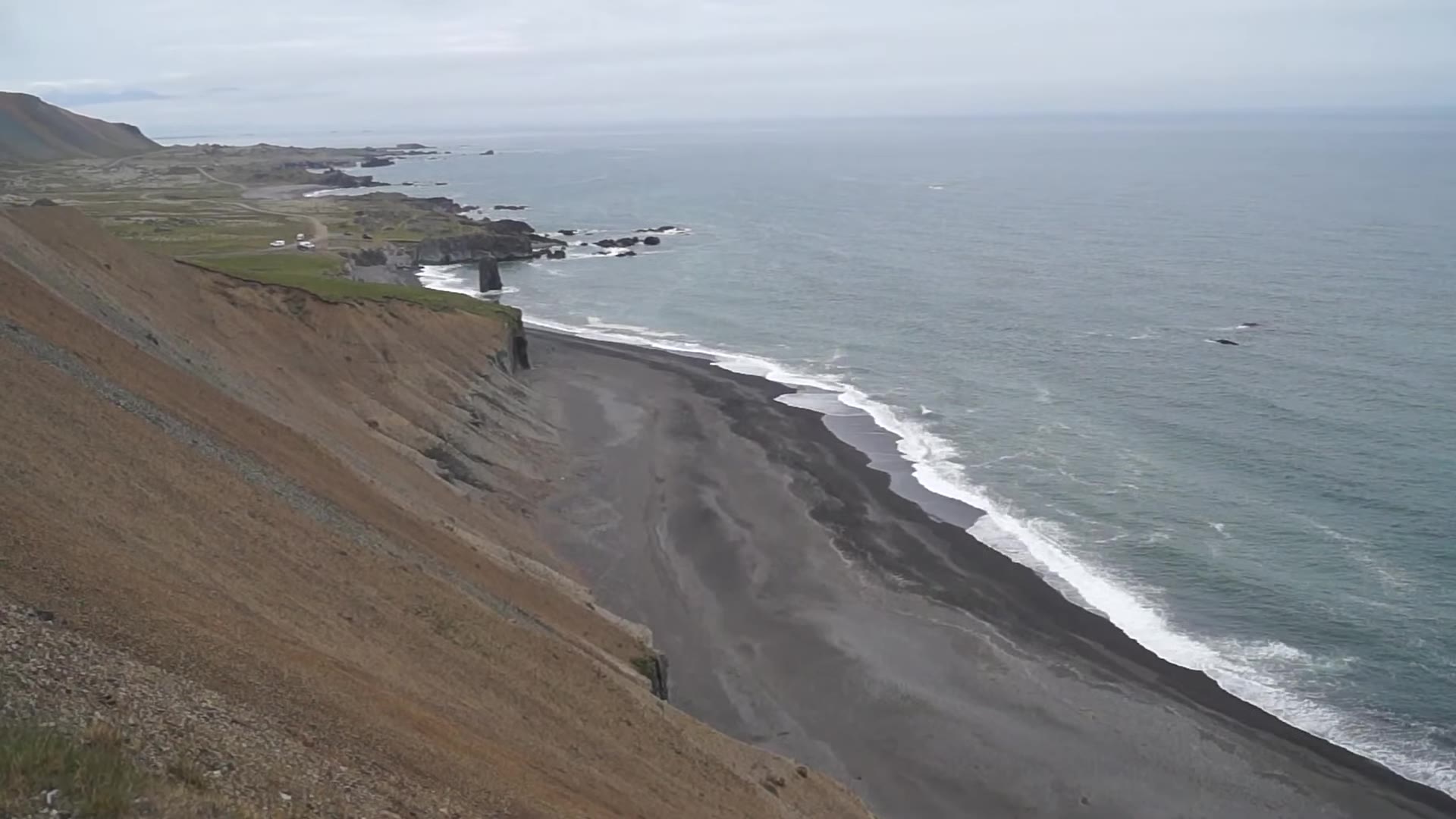
Full-viewport stage (several plates in one folder):
::gallery{folder="plates" layout="expose"}Cover stills first. When a plate has a paired video, the runtime crossfades into a muted loop.
Story (tall scroll plates, same pairing):
::gallery{folder="plates" layout="story"}Cover stills first. When a plate has a paired video, the runtime crossfades into a muted loop.
What authors control
| Control | Role |
|---|---|
| Folder + same-stem pairs | Source of truth for the set |
layout | expose / stage / story for immersion UX |
ratio / width / height | Constrained plate box (optional) |
Sidecar title / body / overlay / tone | On-image caption |
Sidecar video: / poster: | Explicit pair when stems cannot match |
| Still-only files | Valid plates; no motion required |
You do not open a CMS media library to ship a short loop with an article. Change one attribute when the layout or box should change; keep the folder.
One more way to perform the page
Folder-backed stills already made a set of photos part of the writing, not a side channel. Immersive plates add breath: the cover lands immediately, then motion takes over when it can. That is a narrow feature on purpose. Web Device’s bet is larger: the page is a place where text and media can be performed together, with small, composable tools instead of a new content type for every effect.
When the writing needs a still, use a still. When a plate should feel like weather moving past a window, put the cover and the loop in the same folder and let the layout do the rest.